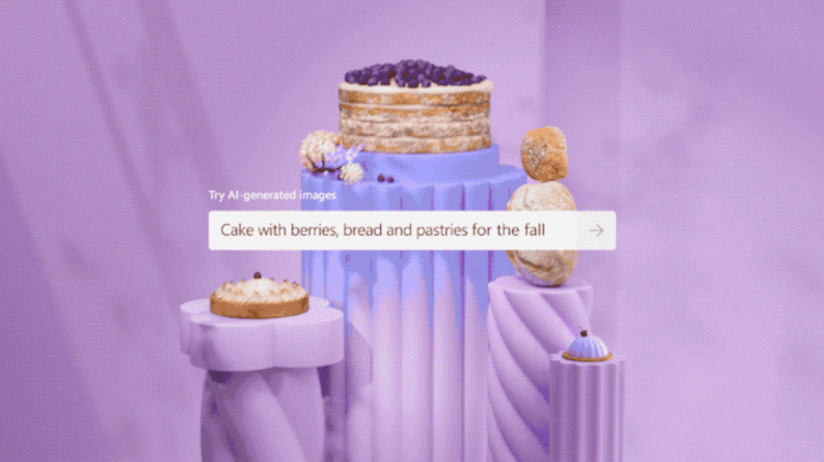
Microsoft has built the first true practical use of text-to-image AI technology with a new tool called Designer. It may sound innocuous, just another Office-integrated tool to create Powerpointy content. But I believe it’s actually the beginning of a revolution: good design without designers or even an interface, thanks to artificial intelligence.
Whether we like it or not, this first version of Designer feels like the future of design. At launch, Microsoft Designer appears to be trying to out-canvas Canva by producing designs for any kind of use, from cards to posters to social media posts, just using AI and an interface so simple that it feels like no interface at all.
It’ll be a difficult task. Canva is the $40 billion company built by Melanie Perkins and Cliff Obrecht on the premise that the Adobe Suite and other graphical tools were too complicated for mere mortals. People needed something simple to create Hallmark-ish social media posts announcing the wedding you don’t want to go to, the candle shop mailing materials you catatonically read eating your cornflakes, or perhaps those office retreat posters that at night show up in the marquee for your very own Jordan Peele horror movie.
All that stuff needed to look okay, and Canva delivered 250,000+ templates to transform into your designs. It was like a modernized web version of Broderbund’s Print Shop, the legendary 1984 program that was the original design-for-dummies app. After a long journey, Canva became a raging success, and rightly so. The company just announced yesterday that it crossed the 100-million active users mark.
The best interface is no interface at all
It will be very hard to stop that momentum, but Microsoft seems to be building the elements to challenge Canva’s very premise of scale and user friendliness.
To start with, Microsoft already has Office, with 345-million paid user seats and more than a billion in total. But, more importantly, this new tool seemingly makes graphic design even easier than what Canva does. That combination may steal users away from Canva, people who ironically brought this app to business environments after successfully using it at home.
The key differentiator for Microsoft is that Designer doesn’t require you to browse through templates or learn anything at all. In fact, it doesn’t even require you to work if you don’t want to. Here’s how it works according to the demo.
First, you write a text of what you want to communicate, like “Martina’s baby shower.” Designer appears to analyze that text input and automatically present you with six graphic treatments with different orientations and aspect ratios to choose from, all using images that match your idea. These layouts—which also can be automatically animated, according to Microsoft—can be used for anything you choose, from a poster to a card to a social media post.
At that point, you can either pick one or choose to replace the images in those options with anything you want. It can be your own photos but, more interestingly, you can type what you want to see in another text prompt and, by the magicks of the mighty DALL-E, Designer spits out new design options illustrated with synthetic images. All these are unique, thanks to the randomization of this AI technology. In the demo, the results look very good, but we will have to see how Microsoft has implemented DALL-E to avoid the occasional horrors.
Again, you now have the opportunity to just pick one design and be done with it, or, if you want, you can manually tweak the final design in a new window. The design appears to be fully editable: no text is baked into the image. You can even pick a new layout variation from a suggestion drawer, which will make all the elements appear to automatically rearrange on the window to match it.
Designer is in a closed beta, but you can join the waitlist here. Once it gets out of this limited release, Microsoft plans to include it with the paid Microsoft 365 Personal and Family subscription, but also as a free web app with limited functionality. The Redmond company has not announced these limited functions, however.
“With Designer, there’s no need to spend time building cards or social media posts from scratch. And you no longer need to search through thousands of premade templates,” Microsoft said in its announcement. Unless you want to fine-tune your creation, there’s basically no interface. No learning curve. No real work to do. You just seem to get instant good-looking results, even if it’s likely you’ll want to tweak your image prompt to ultimately achieve the look you want. Instead of wasting your time browsing, choosing, and pushing pixels around until you’re satisfied, you become a curator of an endless stream of cool stuff to satisfy your graphics needs.
If that sounds like a quantum leap for design aficionados—from mom-and-pop shops to office workers worldwide—that’s because it kind of is. Of course, this is just the first version of the tool. It looks simplistic—which seems to be the point—and, like DALL-E itself, it will surely be flawed. But the possibilities, as the AI evolves and acquires new abilities, are, frankly, overwhelming.
It’s just the beginning
So, while we were all enjoying the craziness of these text-to-image AI tools, or complaining about how they were built on the sweat of real artists while worrying about how it may destroy jobs, Microsoft went ahead and produced a killer app that, if Canva doesn’t evolve, could mark the beginning of the end for not only its dominance, but, I suspect, also higher end tools that may not evolve enough (or fast enough) for this new era of AI generation.
The next versions of Designer—and whatever other tools other companies can come up with—will be progressively more and more sophisticated. This is always the way with any software as technology matures. In traditional creative software, this sophistication and power growth come at the expense of a more complicated interface. Photoshop is a perfect example of this, transitioning from a nimble, easy to understand retouching tool into a juggernaut that seemingly speaks an alien language no matter how many “How to get started” tutorials Adobe can throw at it.
I suspect that overcomplication will also reach Canva, as with every other software in the history of software, from Word to Instagram. But even if the app stays lean, the possibilities of AI-based UX seem even leaner. They will keep getting more powerful and sophisticated with time, yes. Exponentially so, measured by the quality of their output, which still has flaws at this stage. The basic interface—their non-interface—will most probably remain the same. In fact, it can be argued that, as text interpretation AI gets smarter in parallel and new features get added—like models learning your taste—it will only become simpler to master.
Which creative software company will best harness the power of AI and reign supreme, however, is something we have yet to divine. Canva or Adobe—the latter of which already uses AI in Photoshop, from smart selections to neural filters for color matching or scaling—will not stay still. Adobe’s artificial intelligence, beyond its cool demos, feels quite flawed to me compared to something like DALL-E and Stable Diffusion. The fact that Microsoft itself had to resort to signing some kind of agreement with OpenAI, the developer of DALL-E, to make Designer is significant.
Ultimately, whoever is the new king of the hill won’t really matter: the AI will always win this new software war.
—
We reached out to Canva for comment about Microsoft’s new tool and we will update this piece as soon as we hear back.
Source by www.fastcompany.com


